If the original video does not work then here it is from YouTube:
Sunday, 27 April 2014
Evaluation
This is my coursework evaluation i created using a software called Pow Toon. Hope you enjoy:
If the original video does not work then here it is from YouTube:
If the original video does not work then here it is from YouTube:
Saturday, 26 April 2014
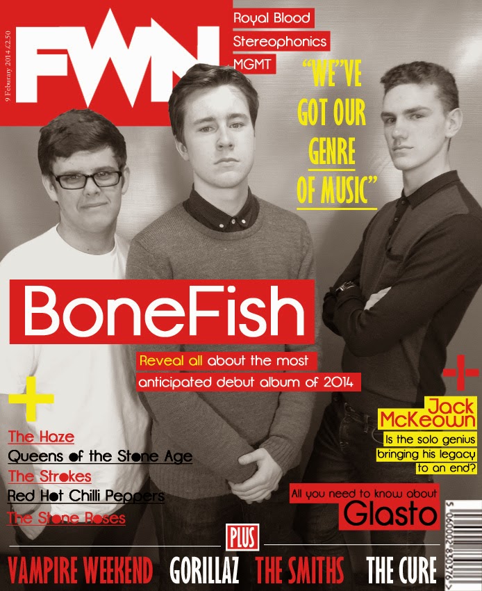
Edited Front Cover
When publishing my magazine I realised i had made a couple of mistakes, the main mistake being my quotation I have placed near the top right in yellow font. I missed out the word "own" and so with this being fixed I have finished my magazine:
Original:

Edited:

Original:
Edited:
Wednesday, 23 April 2014
Production Log
Here is my production log to show how I constructed my magazine by each day from the start until the final product:
Day
|
Task
|
Equipment
|
People needed
|
Location
|
Day 1
|
Take photos for front cover of magazine
|
Fujifilm finepix SL300 camera
|
Alex Laidlaw-Band
Aaron Manley-Band
Charlie Newton-Band
Me-To take photos
|
Schools green room
|
Day 2
|
Construct front cover
|
Packard Bell Home Computer/ Mac/Photoshop
|
Me-To construct magazine using Photoshop
|
Home/School-emailed it to myself to work on in
school
|
Day 3
|
Finish front cover
|
Packard Bell Home Computer/Photoshop
|
Me-To finish constructing magazine using Photoshop
|
Home
|
Day 4
|
Take photos for contents page of magazine
|
IPhone 4s camera
|
Carl Johnson
Aaron Manley
Joe Law
Jack McKeown
|
Outside school(brick wall), Green room, Home
|
Day 5
|
Upload photos and start to construct contents page
|
Packard Bell Home Computer/ Mac/Photoshop
IPhone cable to upload taken photos
|
Me-To construct magazine using Photoshop
|
Home/School-emailed it to myself to work on in
school
|
Day 6
|
Finish creating contents page
|
Packard Bell Home Computer/Photoshop
|
Me-To finish constructing magazine using Photoshop
|
Home
|
Day 7
|
Take Pictures for Double Page Spread
|
IPhone 4s camera
|
Alex
Laidlaw-Band
Aaron
Manley-Band
Charlie
Newton-Band
|
Outside School (Against brick wall)
|
Day 8
|
Construct Double Page Spread
|
Packard
Bell Home Computer/ Mac/Photoshop
IPhone cable to upload taken photos
|
Me-To construct magazine using Photoshop
|
Home
|
Day 9
|
Finsh all/ add ajustments and work on feedback
|
Packard Bell Home Computer/ Mac
|
Me- To work off feedback and edit
|
Home/School
|
Monday, 21 April 2014
Production Log For Main Image Image
This is the image I used

Task: Photo for Front Cover
Date: 10/4/2014
Equipment Needed: IPhone 4S camera
People Needed:Band 'BoneFish'
Props Needed: Own clothes
Location: Green Room
Possible Problems: Phones battery life, quality of image, lighting issues
Evaluation of Task: Went well, took the image quickly from a lower angle ready for editing and uploading
Penguin Jumper:

Grey Jumper:

Blue Shirt:

Plain White T-Shirt:

Front Cover, Double Page Spread and Contents Page
Here is my final Front Cover, Double Page Spread and Contents Page.


Front Cover Screen Shot Progress
The Progress
This is the series of screenshots I have taken to show the progress of my final front cover. I will show how it started from the front covers main image to the final product. Here are the screen shots and the progress of my magazines front cover.
1.

It started with my original image. I took many which looked similar using my IPhone camera but this was the best image i found in terms of quality and positioning. From the main image I could model the other codes and conventions around it.
2.

I then reduced the images saturation to black and white as this suited the front cover best. As well as this I placed my masthead in the top left hand corner as this is the house style I am following. I imposed the heads of my band in front of the masthead.
3.


Also, I added a caption underneath the headline in smaller font and highlighted "Reveal all" in yellow to make it stand out. As well as this I decided my colour scheme for the front cover would be red, white, yellow and black.

I then also added a quotation from the band and made the font yellow to make it eye catching. I got this idea from the first magazine cover I looked at which can be seen to the right:
5.


6.


I then added a plus box and added different artists at the bottom in alternating colours and in a medium sized font as well as filling the "o" in on the left hand side.
I then made some additional changes and cleaned up the front cover and my final front cover is underneath:

This is the series of screenshots I have taken to show the progress of my final front cover. I will show how it started from the front covers main image to the final product. Here are the screen shots and the progress of my magazines front cover.
1.
It started with my original image. I took many which looked similar using my IPhone camera but this was the best image i found in terms of quality and positioning. From the main image I could model the other codes and conventions around it.
2.
I then reduced the images saturation to black and white as this suited the front cover best. As well as this I placed my masthead in the top left hand corner as this is the house style I am following. I imposed the heads of my band in front of the masthead.
3.
I then added in my magazines masthead and titled it the name of the band. I used the Opifico font, a font I have used throughout the creation of my magazine as a whole. I boxed it in red to make it stand out.
4.

I then also added a quotation from the band and made the font yellow to make it eye catching. I got this idea from the first magazine cover I looked at which can be seen to the right:
5.
I then added my bar code in the bottom right hand corner as well as some of the other bands featured in the magazine which I have placed to the right of the masthead which NME do consistently. Examples of this can be seen underneath:

I then added the smaller features and included plus sings (+) to identify that it is additional information. I used the same font again.
7.
I then made some additional changes and cleaned up the front cover and my final front cover is underneath:
Thursday, 17 April 2014

Tuesday, 8 April 2014
Double Page Spreads
These are my double page spreads. I am undecided which one to use as my final double page spread but here they are:

This is the first attempt. I have made some changes since the progress check. This double page spread has some pros and cons and these are:
Pros:

Pros:
This is the first attempt. I have made some changes since the progress check. This double page spread has some pros and cons and these are:
Pros:
- Good image quality
- Follows house style
- Sticks to a colour scheme (red, white and black)
- Original idea and looks similar to Contents Page and Front Cover
Cons:
- Looks too similar
- Not much information
- Hard to read text at times
- Too similar to NME
This is the alternative attempt I created. It is similar to the first idea but has some differences. Like the first one, this double page spread also has some pros and cons:
Pros:
- Good image quality
- Sticks to a colour scheme (yellow, white and black)
- Original idea
- Differentiates itself from the Contents Page and Front Cover
- Stands out
Cons:
- Looks too similar
- Not much information
- Hard to read text at times
- Too similar to NME
- Not much of a double page spread
Double Page Spread so far
I have started my double page spread on Photoshop. I looked at different NME double page spreads to create mine. This is my unfinished double page spread. I need to change the main image and do some final editing before finishing as the main image is not mine. Here it is:


Underneath was the double page spread which I went off to create mine:
Thursday, 3 April 2014
Double Page Spread Template
Template Layout

This is the template I made on InDesign for my Double Page Spread. From this I will create my Double Page Spread on Photoshop. This may not work and I will try a series of layouts for the Double Page Spread until I find one that fits perfectly. Here is the screenshot of the image taken from InDesign underneath.

Wednesday, 2 April 2014
Contents Page Progress- 1.
Contents Page
I will show the progress of my contents page over the next few blogs. I will show how I started up until the final piece. I started by looking at some of NME's contents pages. This helped me determine a layout and particular house style that interested me most.
Step 1.

I started by measuring a real NME contents page from one which I had bought previously. From this, I measured the height as 30cm and width as 24.5cm, which I then typed into Photoshop to make the desired sized document.
Following this I selected the Line Tool and kept the weight at 1xp. I then drew out the lines carefully and shaped my contents page as these lines are an indication of where to place the images and text.
Step 2.

I then added my contents page title using a font I downloaded from DaFont called Opifico. I placed the title at the top of the page and made the font bold to stand out. I picked the font as it is simplistic but when placed, looked correct. As well as this, I included my small index to the right of the page and used the Georgia font but put it in italics and bold for the Plus. Furthermore, for the vertical index, I used Opifico again as this is the house style font.
Step 3.

 For this step I created my Promotional Offer advertisement. I did this because it is common of magazines to put an advertisement for their own magazine at the start of the magazine, usually on the contents page as they want to sell their product further. I created the promotional offer box by first selecting the Rectangle Tool and making sure the box was red as the colour scheme is red, black and white for the contents page. I then used the Opifico font again when making the text and put the % sign bolder to catch the readers eye when looking at the contents page.
The promotional offer box can be seen better to the right.
Tuesday, 1 April 2014
Contents Page Progress- 2.
From what I had made already, my contents page needed the images and so I went out and got the images I need. I took most of them using my IPhone 4S camera and one using the professional camera, which I will use for my front cover main image and double page spread main image
Step 4.


I then added one of my pictures as well as adding a short paragraph underneath the image, explaining the meaning of the image. I also left a fair bit of space from image to the end of the page to the right to create a border effect. I made the images caption bigger and red and then put the short paragraph underneath.
The image and caption can be seen better to the right.
Step 5.

As you can see, I included the remaining images on to the contents page, all which I have taken. I placed and balanced each of the images carefully and made them look as organised as possible.
Step 6.

As you can see, I included the parts boxed in red. I added all captions and paragraph to each of the images as well as the date underneath the title. The paragraphs make the contents look busy and give useful information for the reader.
Step 7.

I then added the numbers for the page references for the magazine. I used Impact font and boxed the numbers in white.
Step 8.

I then finished by adding my masthead. I placed this st the top of the page, above the title of the contents page. I need to get a main image for my contents page to complete the contents page which I will do soon.
Step 4.
I then added one of my pictures as well as adding a short paragraph underneath the image, explaining the meaning of the image. I also left a fair bit of space from image to the end of the page to the right to create a border effect. I made the images caption bigger and red and then put the short paragraph underneath.
The image and caption can be seen better to the right.
Step 5.
As you can see, I included the remaining images on to the contents page, all which I have taken. I placed and balanced each of the images carefully and made them look as organised as possible.
Step 6.
As you can see, I included the parts boxed in red. I added all captions and paragraph to each of the images as well as the date underneath the title. The paragraphs make the contents look busy and give useful information for the reader.
Step 7.
I then added the numbers for the page references for the magazine. I used Impact font and boxed the numbers in white.
Step 8.
I then finished by adding my masthead. I placed this st the top of the page, above the title of the contents page. I need to get a main image for my contents page to complete the contents page which I will do soon.
Looking At Different Double Page Spreads
I have been looking at a range of NME's double page spreads as part of my planning and research. This will help me create my double page spread which I have started to make using Photoshop. These are a series of different double page spreads which I see as inspiration. The majority of these double page spreads contain pictures with three or less people as I am looking at layout, font, colours and images. I will do a seperate blog on double page spreads with four piece bands as the feature. These are some of the double page spreads which I have screen-shotted from NME's website:

 This is the double page spread from the latest edition of NME. The layout for this double page spread is fairly simple but looks bold and eye-catching for audiences through the title stating "NME HEROES". The image central is professionally taken and has been placed in the centre of the double page spread. The boxed font surround the image is ideal and something I have also been using when making my double page spread.
The magazines front cover is to the right.
2. Johnny Marr


The colour scheme for this double page spread, again from the same NME edition, is consistent and follows a blue, black and white scheme but with this double page spread, the main image takes up both of the pages with the text and title placed in to the right hand side. This is a more modern take on creating a double page spread
4.Jake Bugg

This double page spread is from the edition in which NME updated their look for the first time in years. Again the image take up both pages. I feel as though it will be a challenge to get an image with amazing quality and to spread it across both pages.

This is the front cover in which the last double page spread was taken from can be seen to the right.
1. Julian Casablancas
 This is the double page spread from the latest edition of NME. The layout for this double page spread is fairly simple but looks bold and eye-catching for audiences through the title stating "NME HEROES". The image central is professionally taken and has been placed in the centre of the double page spread. The boxed font surround the image is ideal and something I have also been using when making my double page spread.
 The magazines front cover is to the right.
2. Johnny Marr
From the same new edition of NME comes this similar styled double page spread as it is a continuation of the article. The image here does not take up the whole or one side of the double page spread which leaves a lot of blank canvas but, it still looks simplistic and not over complicated or littered with text and images.
3. Franz Ferdinand
4.Jake Bugg
This double page spread is from the edition in which NME updated their look for the first time in years. Again the image take up both pages. I feel as though it will be a challenge to get an image with amazing quality and to spread it across both pages.

This is the front cover in which the last double page spread was taken from can be seen to the right.
Subscribe to:
Comments (Atom)